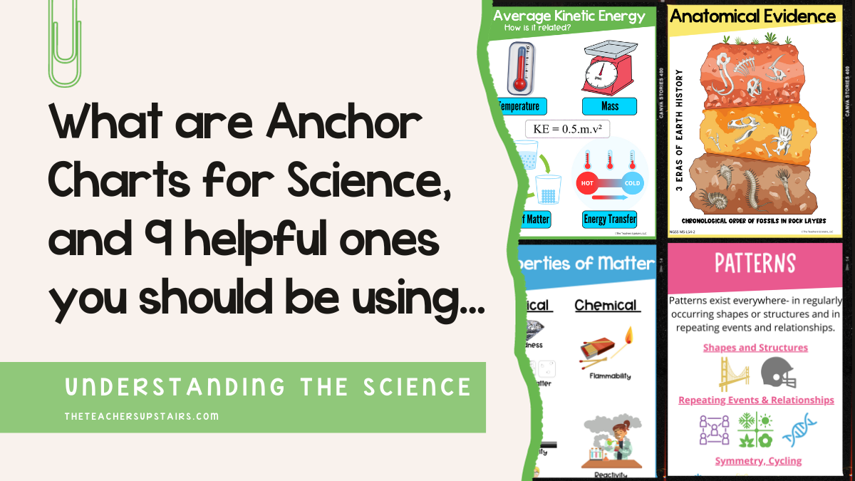
What are anchor charts? Simply stated, anchor charts for science are a tool used to support instruction. They “anchor” a student’s understanding of scientific concepts. They capture the most important content or overarching theme within the Next Generation Science Standards. In short, anchor charts bring a student’s thinking alive and keeps scientific concepts at the forefront of a student’s mind.
Before we begin our discussion on anchor charts in the science classroom, you may also be on the search for an engaging lab simulation, video, or literacy text to go along with your upcoming lesson. If you’d like to have more time to create your anchor charts, we’ve put together a major time-saving resource: THE Ultimate Guide of Online Resources for teaching science. The guide is FULL of clickable links to tried and true websites that will help drive home that concept you are teaching. You can grab yours, for FREE, here.
What are anchor charts in Science used for?
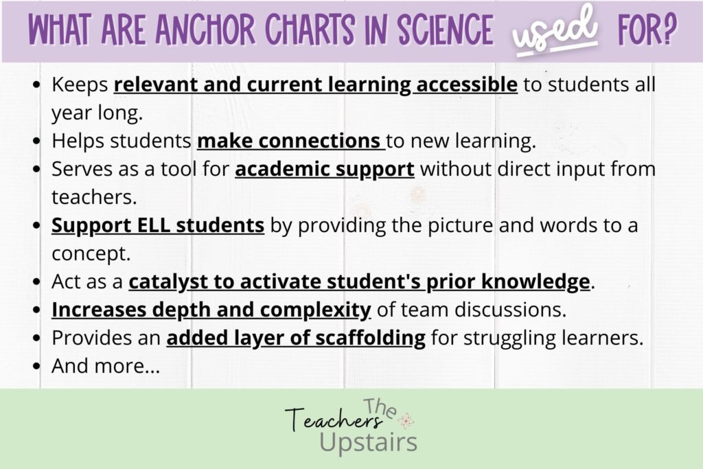
Now that you know what an anchor chart is, let’s talk about how you can use them. Here are some basic uses and advantages in the science classroom:
- Keeps relevant and current learning accessible to students all year long.
- Encourages students to check their work or validate their discussion points.
- Assists students in making connections to new learning.
- Serves as a tool for academic support without direct input from teachers.
- Supports the ELL student by providing a picture along with words.
- Acts as a catalyst to activate students’ prior knowledge.
- Increases the depth and complexity of team discussions.
- Creates a visual reference library for students to engage with.
- Provides an added layer of scaffolding for struggling learners or those under the SPED umbrella.
How to plan and design anchor charts effectively:
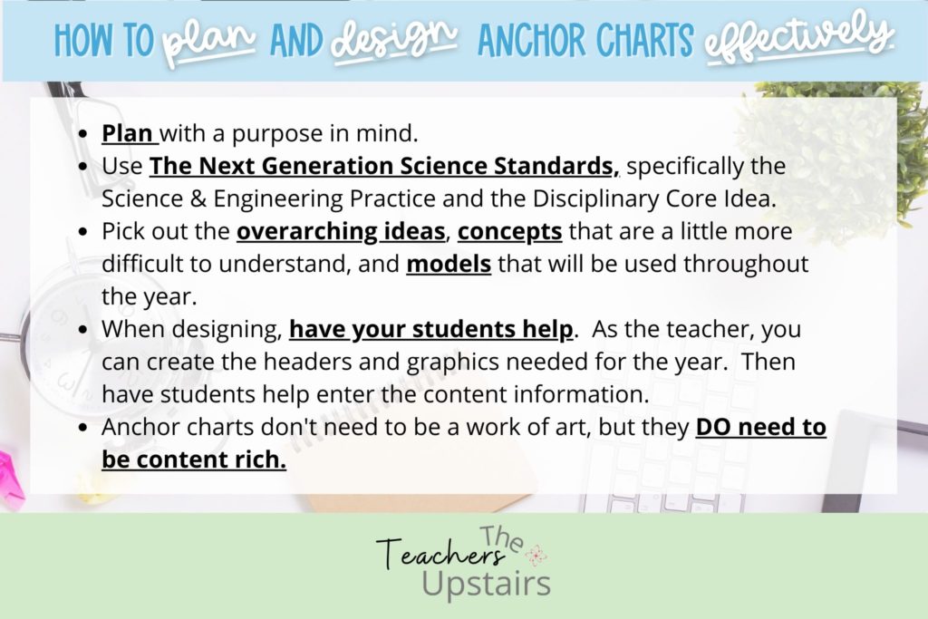
When planning the design of your anchor charts, keep the following in mind:
- Plan with a purpose in mind.
- Use the Next Generation Science Standards (NGSS) to help guide your decisions on what content to incorporate into your anchor charts. Specifically, look at the Science & Engineering Practice and the Disciplinary Core Ideas.
- Pick out the overarching ideas, concepts, and models that will be used throughout the year.
- Create the anchor charts with your students. As a teacher, you will need to plan out what headers and graphics you want to be included. Then, have students help you enter the content information.
- Make the anchor charts colorful.
- Keep them simple and neat.
- Use real-world models / pictures.
- They don’t need to be a work of art. They DO need to be content-rich.
How to use anchor charts in the science classroom:
Teacher Facing:
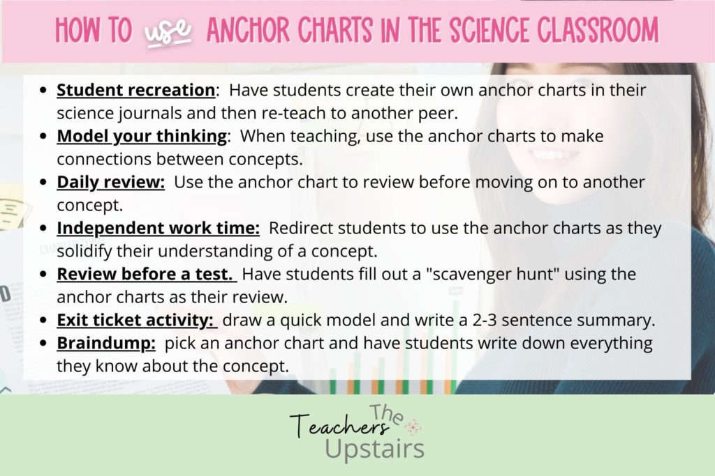
- Model your thinking. When teaching, use the anchor charts to make connections between concepts.
- Use them to bring a concept to life. Many of our students are visual learners, and a picture is worth 1000 words.
- Use anchor charts as a daily review before you move on to another concept.
- Remind students to use the anchor charts during independent or teamwork time. This will save you, the teacher, precious time from having to revisit concepts over and over again.
- Use anchor charts to peak interest. Keep the current unit up and the upcoming unit up at the same time. Students will naturally start making connections to an upcoming unit of study as they learn the current one.
Student Facing:
- Exit ticket activity: 1. Draw a quick model and write a 2-3 sentence summary. 2. Braindump: students pick an anchor chart (or you pick one) and write down everything they know. You can differentiate this by allowing students to draw models that depict the concept.
- Use them as a review for state testing. Provide them with the main header (domain) and students work in pairs or as a team to fill in all they know about that topic. Then meet as a whole class to discuss.
- Allow students to organize their thinking in their science journals. Have them draw the anchor charts in their notebooks. If you go this route, you will need to train your students to refer back to these anchor charts during independent practice, homework, or as a review for a test or end-of-year testing. This helps a student to take ownership.
Here are 9 different anchor charts you should be using:
We are all familiar with anchor charts within the elementary ages. However, anchor charts in a science classroom can be just as valuable, if not more so to help students grasp a scientific concept, understand a frequently used academic word, or be reminded on how to write a conclusion on a lab report.
We have talked about having students help in the creation of the anchor chart, and having students reproduce the anchor charts in their science journal. Below we will be highlighting 9 different anchor charts that we feel are most effective in the science classroom. As these anchor charts are “done-for-you” examples, having students reproduce them in their science journals is a great strategy to incorporate.
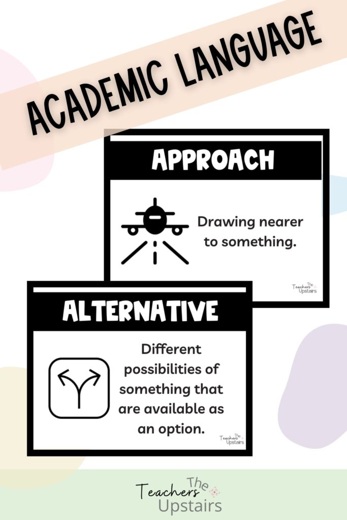
#1: Academic Language
These are 48 of the most highly used words within the NGSS, Crosscutting Concepts and Common Core. By using academic language, students are repeatedly exposed to both general academic and content-specific words within a discipline. Repeated exposure and use of such terms help students to be able to remember and retrieve information learned. Success in a science classroom relies on a student’s ability to understand and use new vocabulary words. You can read more about the importance of academic language here.
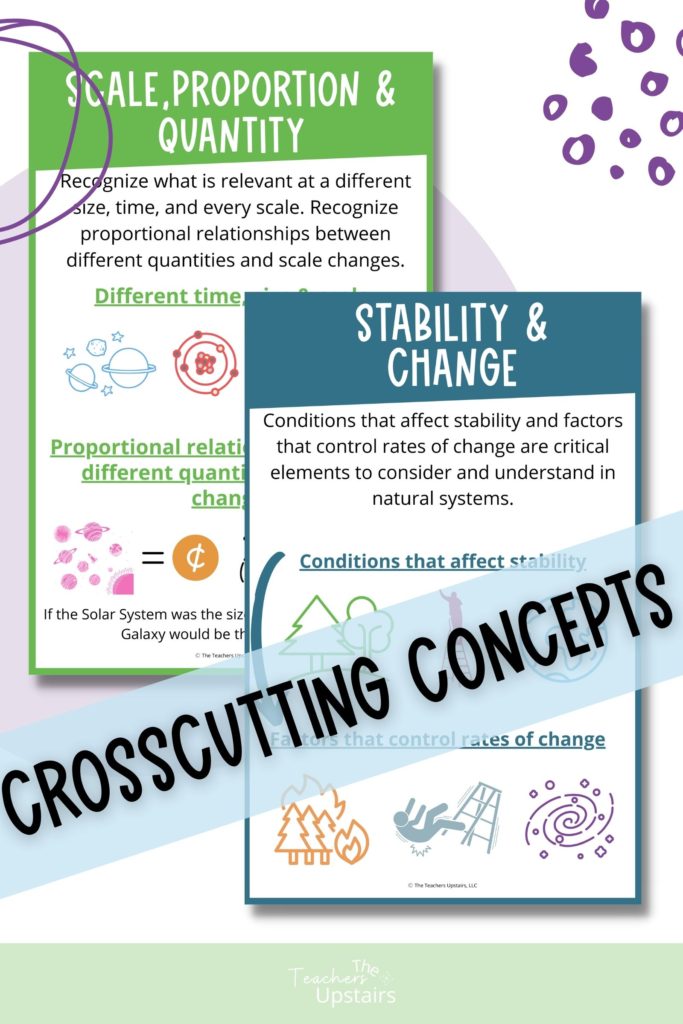
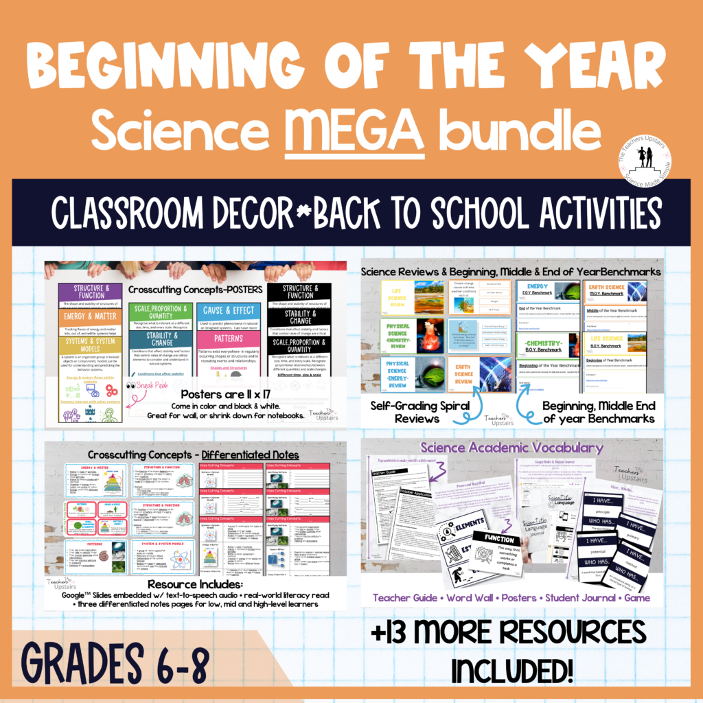
#2 Crosscutting Concepts
The Next Generation Science Standards Cross-Cutting Concepts are important to students because they help students form a deeper understanding of science and engineering. And, it gives them the tools they need to investigate and problem solve. You can read more about the NGSS Crosscutting Concepts here. These Crosscutting Concepts posters are broken down into student-friendly definitions and depict the concept in real-world scenarios.
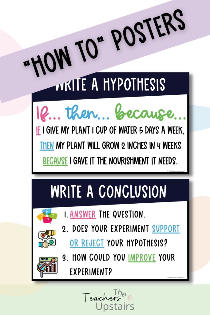
#3: “How-To” posters
Do you ever get tired of answering the same question a bajillion times a day? Or maybe you see the same mistakes over and over again when it comes to writing a hypothesis or the conclusion on a lab report. “How-To” posters help alleviate all of that.
#4: Word Wall
I can hear it all now… a wall full of words doesn’t really do much. In actuality, if it is just a wall full of words — it becomes a distraction. But think about an INTERACTIVE word wall! This is a wall that not only has focus words, it also includes a picture and a student-friendly definition. BOOM! Differentiation at its best.
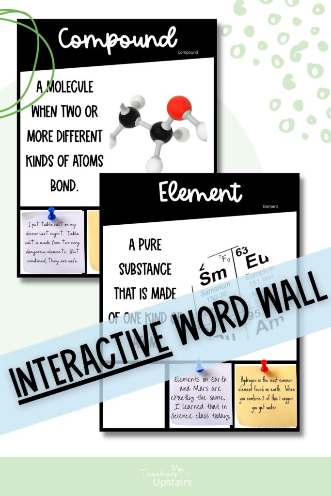
This type of word wall is inclusive to our struggling learners, ELL population, and those under the SPED umbrella. Not only that, when you add a “connection component”, you have now added extensions to all learners including advanced learners. In the word wall picture above, you will notice there are 3 boxes at the bottom of the page. Those are there so when students make a connection with the word or see the word in action in the real world, they can grab a sticky note to record their findings. Students will then place that sticky note on the word wall chart.
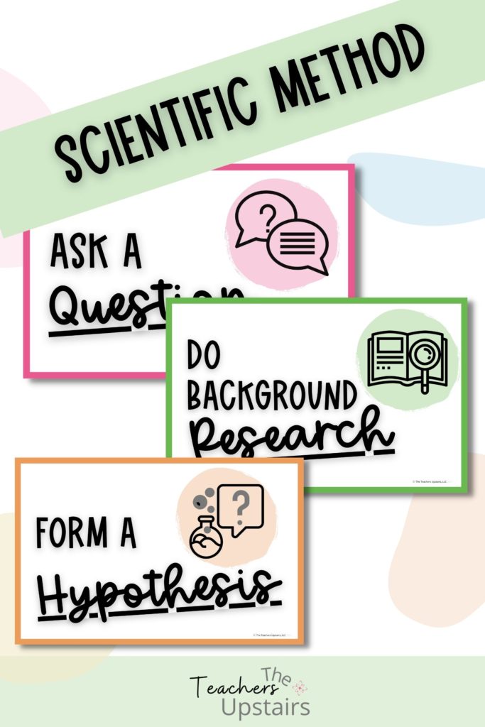
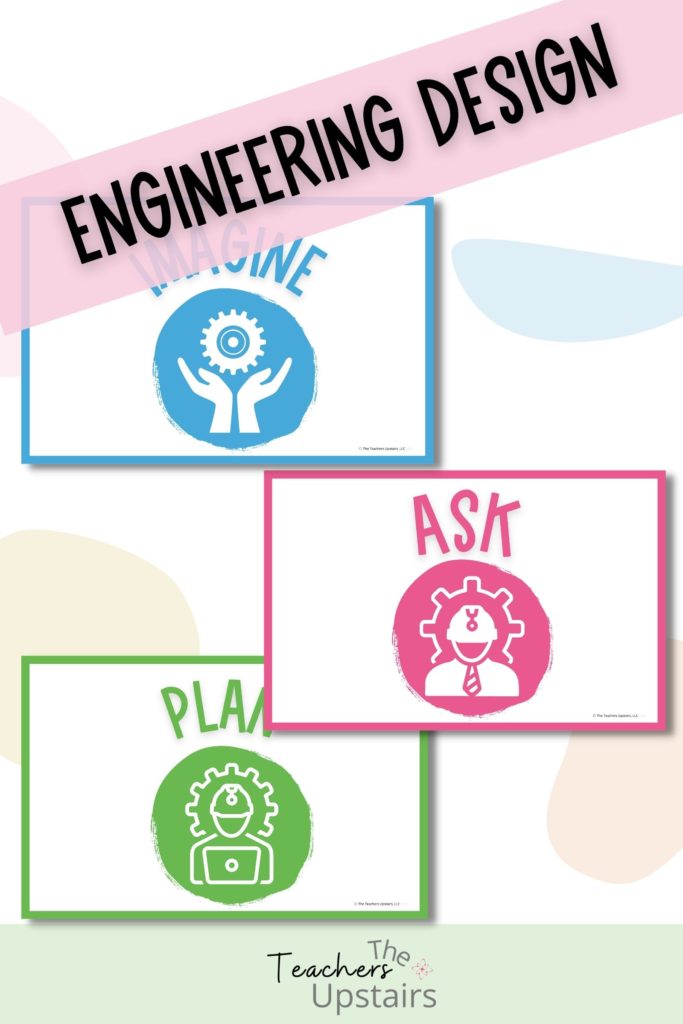
#5 Scientific Method and Engineering Design
Students often confuse the Scientific Method and the Engineering Design Process. By including BOTH kinds of anchor charts on the wall, students can easily differentiate between the two. Such posters are also an anchor when completing labs or their science fair project.
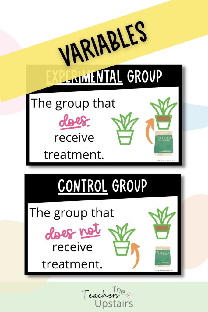
#6 Variables
One of my favorite items of discussion in ALL the labs we do in class is to figure out the variables. These anchor charts are by far one of the most used in our class. Students refer to these daily. As the year goes on, I see their confidence build as they are able to readily pick out the variables.
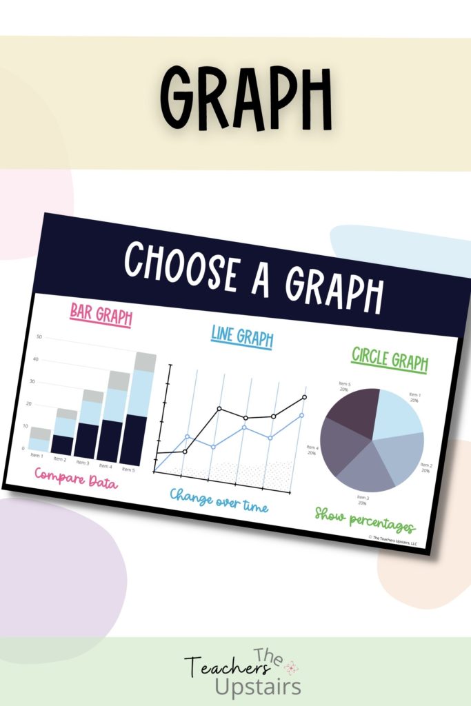
#7 Different graph types
Graphing can be a hard concept to grasp. Many students struggle with which type of graph is best to use in different labs. Anchor charts are a great way in helping them to make the decision as to the proper graph. It also helps solidify their experiment. Are they seeing growth over time? Maybe they are needing to compare data or show percentages. Graph charts are king.
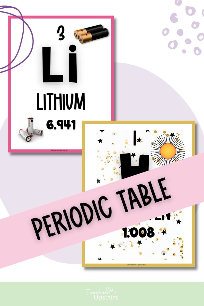
#8 Periodic Table
What is a science room without a periodic table? As we here @theteachersupstairs stress differentiation in our classrooms, we like to make our periodic table just a bit more awesome! We include pictures of the elements so students not only get the information to make calculations but can also see the elements in action. Again, this strategy is perfect for struggling learners, our ELL population, and students under the SPED umbrella. Here is a quick video giving some more detail.
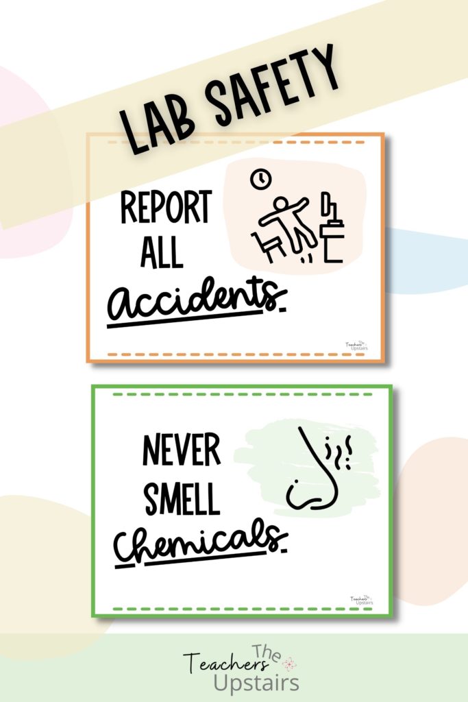
#9 Lab Rules
Above all, when teaching science, we need to keep our students safe. What may seem common sense to you may not be so for another. Having specific rules for lab safety is a must. If you would like some done-for-you lab safety posters, click here.
What are anchor charts? In summary…
First, we talked about anchor charts in the science classroom. Second, we outlined 9 things you should keep in mind when designing and then creating anchor charts. Third, we discussed 9 ways on how to use them effectively. Finally, we provided you with 9 different examples that are beneficial in the science classroom.
As a reminder, if you are wanting to spruce up your science lesson with the perfect online simulation, grab our free gift to you. The Ultimate Guide of Online Resources for teaching science is just a click away.
